

UI/UX DESIGN, CONTENT STRATEGY, REBRANDING
PAZZION.COM
A visual refresh for pazzion.com focused on modernizing PAZZION’s overall digital presence while keeping the mobile experience cleaner, bringing ease, clarity, consistency, and a more refined aesthetic to the platform
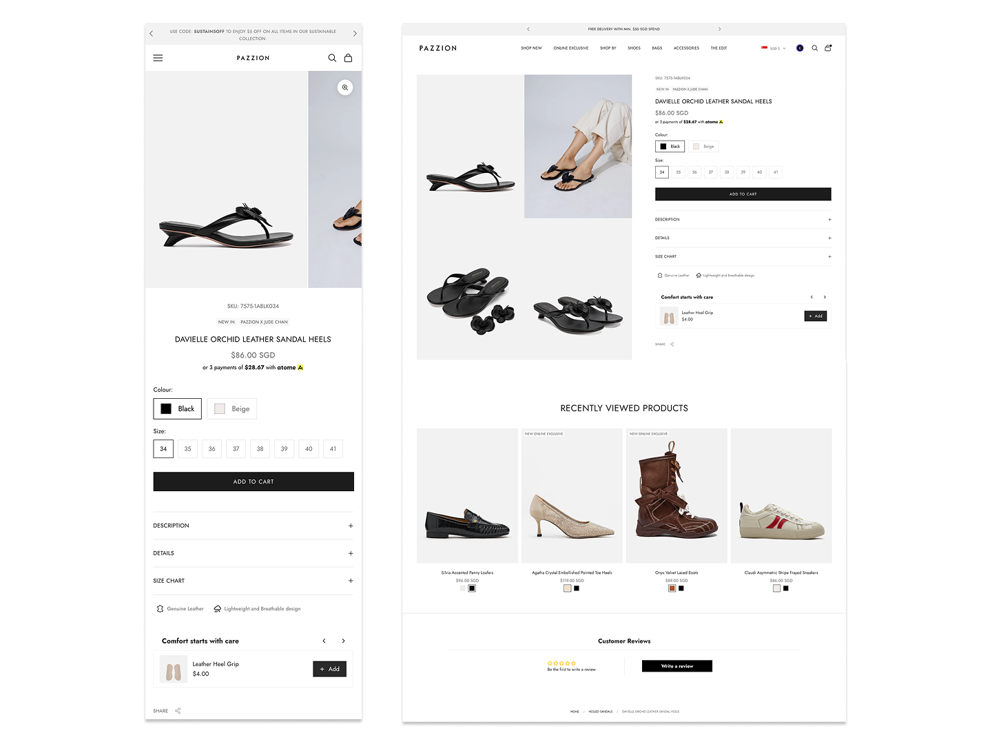
Product Detail Page (PDP)
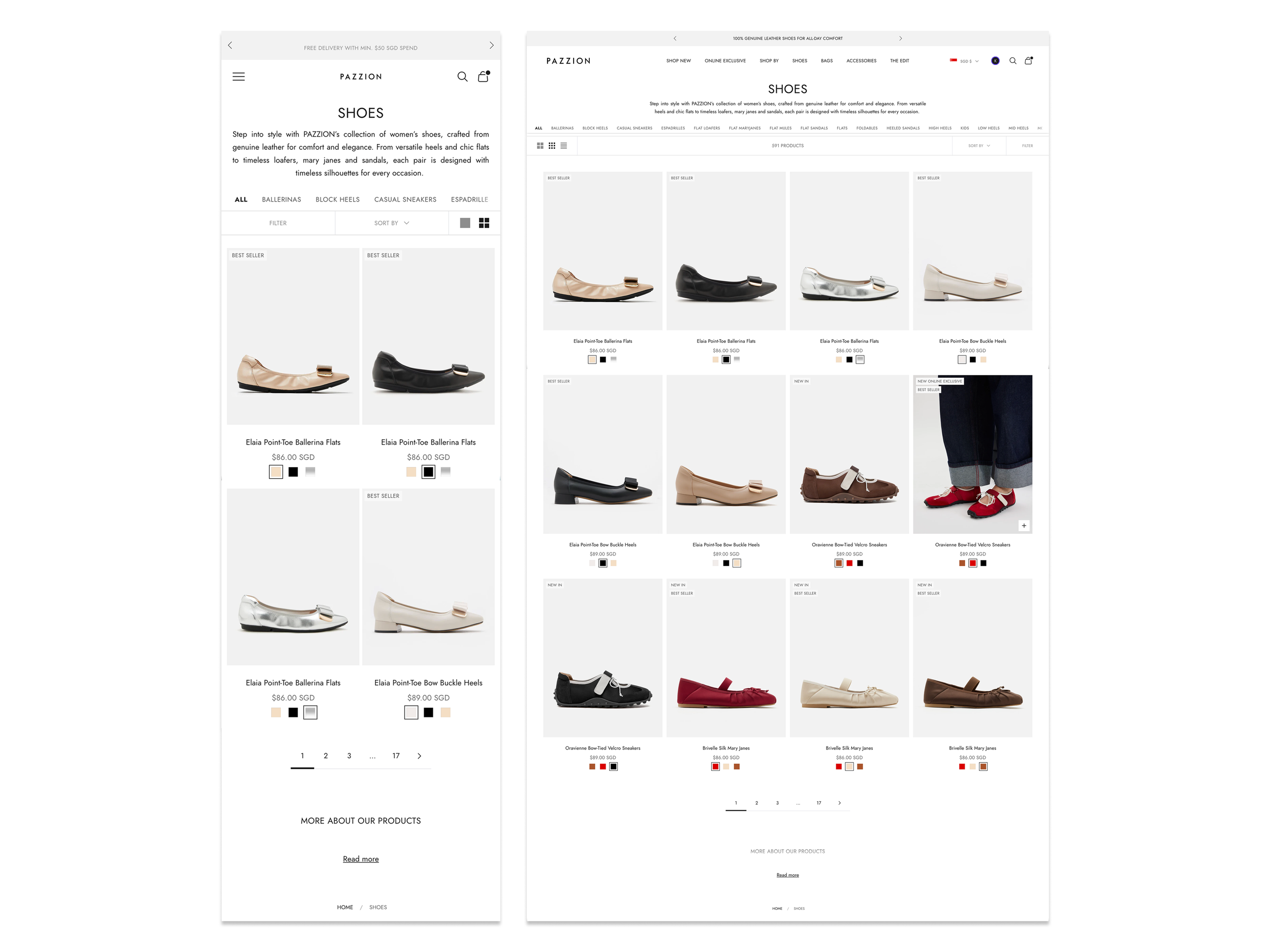
Product Listing Page (PLP)
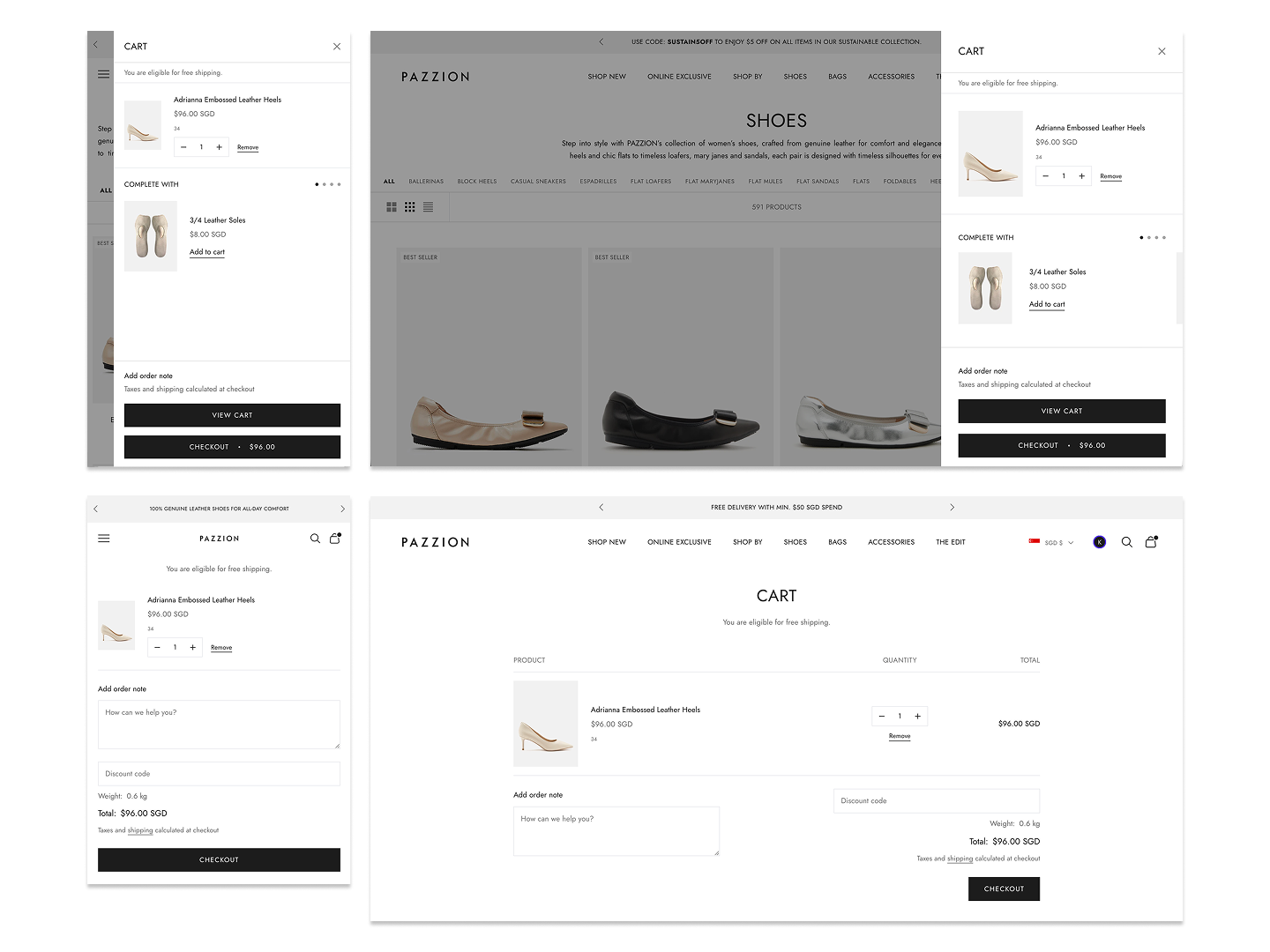
Cart & Checkout Page
The redesign focused on bringing clarity and intentionality to the experience. I reworked the visual hierarchy to better guide users from product discovery to conversion, using spacing, typography, and layout to reduce cognitive load.
The original experience lacked clear structure and prioritization where information was densely packed, with smaller imagery and multiple competing elements that made it difficult for users to quickly orient themselves or focus on key actions.
On listing pages, the tight grid and high content density created visual fatigue, while on product pages, inconsistent hierarchy and fragmented sections disrupted the decision-making flow.
Product imagery was elevated to reinforce the brand’s fashion positioning and supporting better evaluation of details and fit. Content was streamlined and grouped more logically, allowing users to access key information without being overwhelmed.
On listing pages, shifting to a more spacious, image-led grid improved scannability and created a more premium browsing experience. Across both PDP and PLP, the overall direction moved from a outdated interface to a more considered, editorial-style layout that balances aesthetics with usability. The result is a more intuitive and cohesive experience that aligns with modern user expectations while better supporting business and conversion goals.