UX / UI Case Study | 22 Aug to 2 Sept 2022
The Independant Passenger
Overview:
This group project explores how we can design a seamless, intuitive, and accessible digital inflight menu that enhances the dining experience for all travelers.
2-week Design Sprint
for General Assembly UX Design Immersive
Client:
Singapore Airlines
Role:
UI Designer & UX Researcher
The Challenge
The COVID-19 pandemic accelerated the digitalization of physical assets, leading to the replacement of printed food menus with digital ones onboard.
How might we re-imagine the way passengers interact with in-flight menus without causing inconvenience?

A meal at 35,000 feet should be effortless to choose. Yet, for many passengers—especially non-frequent flyers and older travelers—accessing the digital inflight menu can be a challenge. The reliance on multiple steps, connectivity requirements, and text-heavy layouts may create friction in the user experience.
What are the assumptions?
Frequent flyers find it convenient.
Non-tech-savvy passengers & older generations struggle
with accessing menus via in-flight Wi-Fi.
Research Objectives
Identify passenger preferences for digital vs. physical menus.
Understand pre-flight and in-flight experiences with the current system.
Determine if food images impact decision-making.
Identify areas for improvement to create a more self-reliant process
Research Methodology
User Research Approach
30 survey responses gathered insights on
menu access habits.10 in-depth interviews
(Zoom, Discord, in-person) for qualitative data.

Interview Response Mapping
After completing the interviews, the responses were categorised, revealing these main takeaways:
Visuals aid decision-making
Images help set expectations.Online menus are hard to access
Wi-Fi reliance causes frustration.In-flight entertainment systems (IFE) are underutilized
A more seamless integration could improve usability.Passengers prefer automated solutions
Reducing reliance on cabin crew streamlines the experience.Physical menus remain valuable
Some travelers prefer tangible references.Diverse food options & accountability matter
Clear dietary info is crucial.Multi-language support
Ensures accessibility for all passengers.
Problem Statements
From our user research, we identified key challenges faced by different personas in the inflight dining experience:
Maxine, a modern traveler, craves efficiency and autonomy. She needs a seamless way to browse the inflight menu, pre-order her consumables, and access amenities at her convenience—empowering her to make decisions effortlessly and independently.
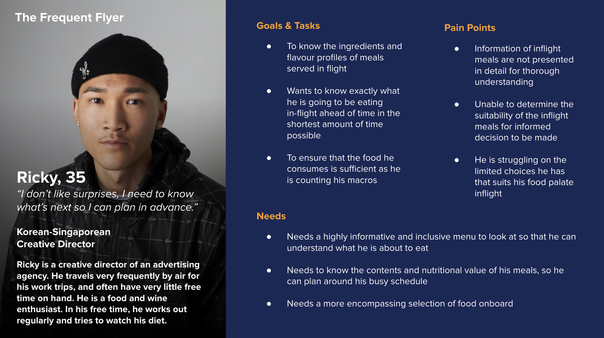
Ricky, a discerning passenger with specific dietary preferences, struggles with unclear menu descriptions. He needs a visually engaging and easily digestible way to assess meal options, ensuring that every choice aligns with his dietary needs and personal taste.
'How Might We' Statements
To elevate the inflight dining experience and redefine passenger autonomy, we crafted two pivotal questions:
How might we empower Maxine with an intuitive, frictionless inflight dining experience that puts control at her fingertips?
How might we transform the inflight menu into a visually compelling, inclusive, and informative guide that ensures Ricky can dine with confidence and clarity?
By addressing these challenges, we’re not just refining an inflight service—we’re shaping the future of passenger experience, where choice, accessibility, and delight converge at 35,000 feet.
Ideation & Brainstorming Solutions
Through an intensive brainstorming session, our team explored, refined, and synthesized key ideas to develop three innovative solutions—each designed to directly address the challenges our users face in the inflight dining experience.
Solution #2:
The Universal Menu
A seamless mobile application that allows passengers to browse a detailed inflight menu at their convenience—eliminating the need for physical interactions that may disrupt others, while enhancing accessibility and personalization.

Solution #1:
The Informative Palate
An inclusive and comprehensive menu designed to cater to diverse passenger needs. This solution enhances the dining experience by presenting rich, detailed, and visually intuitive meal descriptions, ensuring clarity for all dietary requirements and preferences.

Solution #3:
The Independent Passenger
A fully integrated inflight entertainment system feature that enables passengers to explore the menu, place orders, and request amenities effortlessly—giving them complete control over their inflight experience without reliance on cabin crew availability.
The Winning Idea
The Winning Idea
A Fusion of Autonomy & Information
Following 'The Pitch', our team presented our research insights, personas, and proposed solutions. After extensive discussions, we committed to Solution #3: The Independent Passenger as our core direction. However, to ensure a more holistic and user-centric approach, we strategically integrated Solution #1: The Informative Palate—merging autonomy with accessibility.
By combining these two solutions, we empower passengers to be fully self-reliant while providing them with clear, engaging, and inclusive meal information—redefining the inflight dining experience with innovation, independence, and ease.

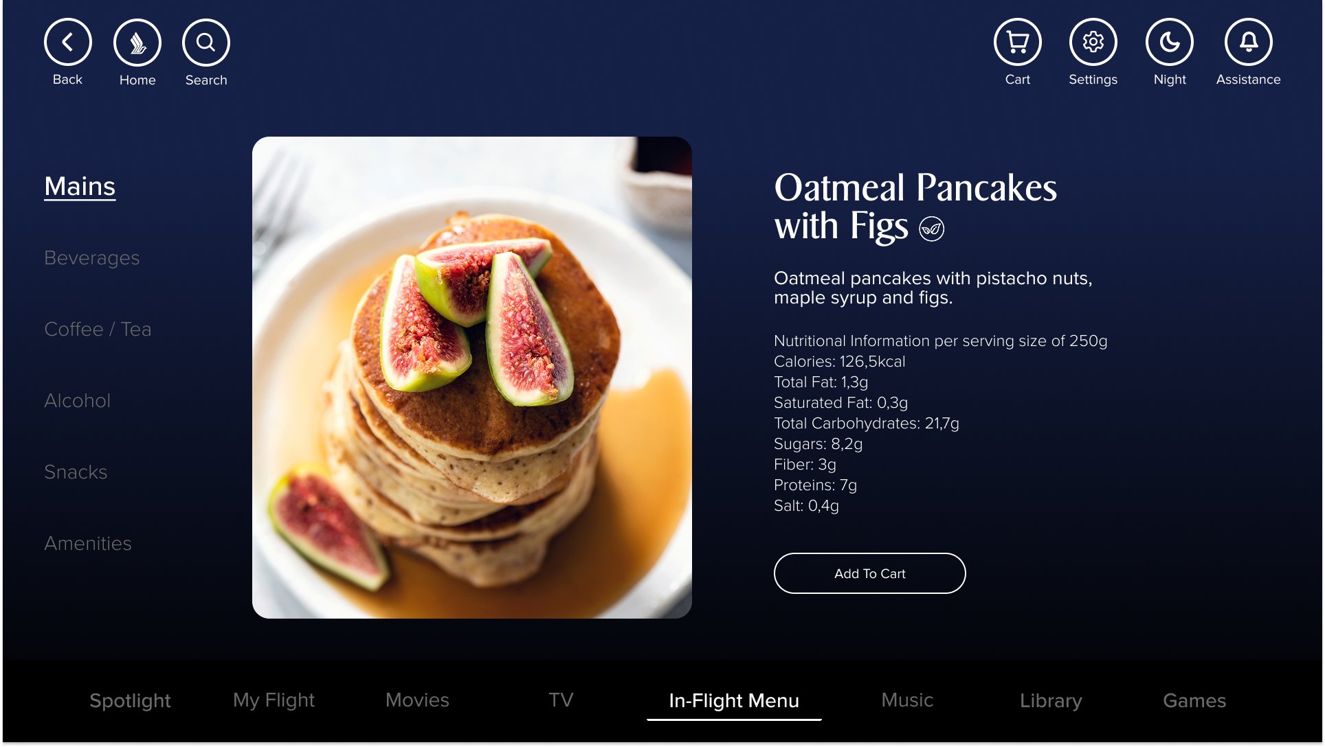

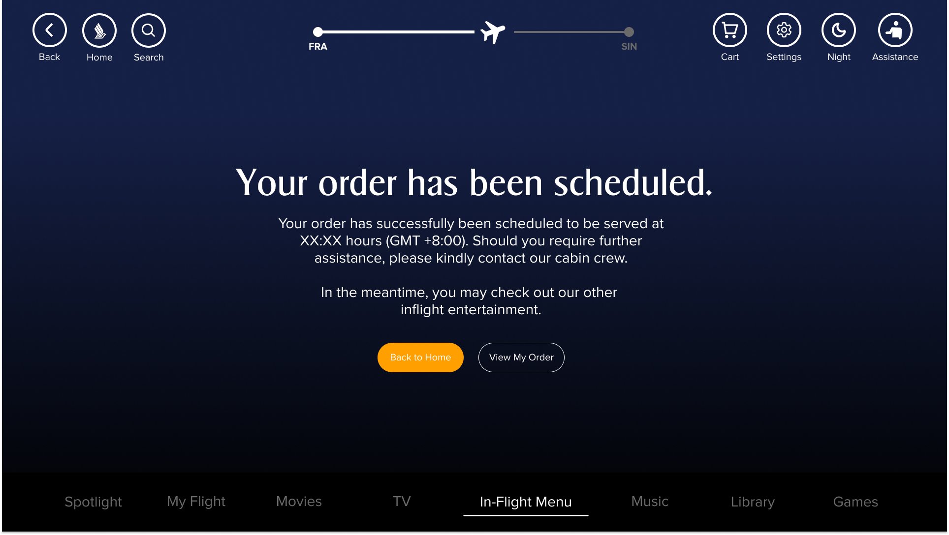

Final Prototype
Here's a glimpse into our final prototype. Best viewed on an iPad.
Reflections:
Design, Collaboration, and the Art of Adaptation
This project was more than just a UX challenge—it was an exercise in human-centered problem-solving at scale. As my first UXDI group collaboration at General Assembly, it was a masterclass in adaptability, resilience, and the power of collective intelligence.
What we learned:
🔹 Great design is a dialogue. Each of us brought unique strengths, filling in gaps for one another.
🔹 Constraints fuel creativity. Aviation regulations, screen limitations, and technical challenges weren’t roadblocks; they were opportunities to refine, iterate, and push boundaries.
🔹 Test early, test often. Usability testing in the mid-fidelity stage is essential—not just to validate ideas, but to ensure we’re solving the right problems with the right solutions.
This journey reinforced that design isn’t just about pixels on a screen—it’s about creating experiences that empower, engage, and elevate.